Union Craft Brewing
Union Craft Brewing was founded in the fall of 2011 and brewing operations officially began in the spring of 2012 with the installation of a 20 barrel brewhouse and the initial launch of Duckpin Pale Ale. The brand was launched with not only the idea of the union of water, barley, hops and yeast, but with the bigger idea creating a union within the community to come together around beer; a reward for the hard working people of Baltimore.
SERVICES:
/ BRAND IDENTITY / PACKAGE DESIGN / COLLATERAL DESIGN /
-
The Challenge:
When founder, Jon Zerevitz, first came to us, he and his partners had big plans to open “Duckpin Brewing”. After several explorations and iterations at a Duckpin logo, the team decided to shift gears, and the name UNION was born. Jon and his wife, Julie, are both fantastic graphic designers, so the task of designing for them was a true honor. They felt too close to the project to brand it on their own, but have always provided stellar art direction along the way.The Solution:
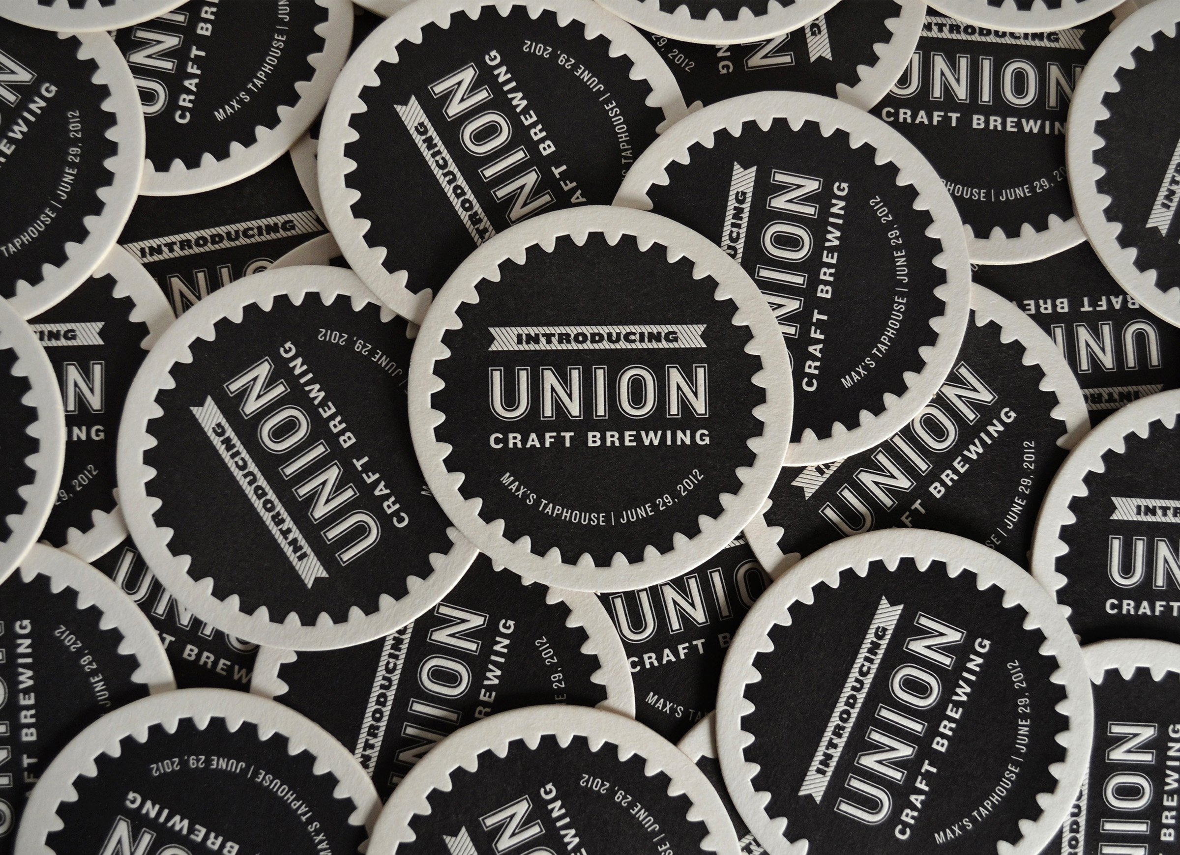
Once the name UNION was established, we suddenly had a lot of imagery come to mind. Not only did it represent the name of the street the original brewery was located on, but it conjured images of working unions and people banding together. The cog logo took its inspiration from the working class that Baltimore has long been associated with. Its industrial nature, paired with the function of a cog being part of a larger whole speaks to the mission of what UNION stands for. Over the years, we’ve partnered with UNION on many different types of projects as they have worked hard and had great success in creating a community driven space with the mission of uniting people.
“The cog felt right almost immediately. We all loved this one.”
– Jon Zerivitz, Founder + Creative Director
-
The Challenge:
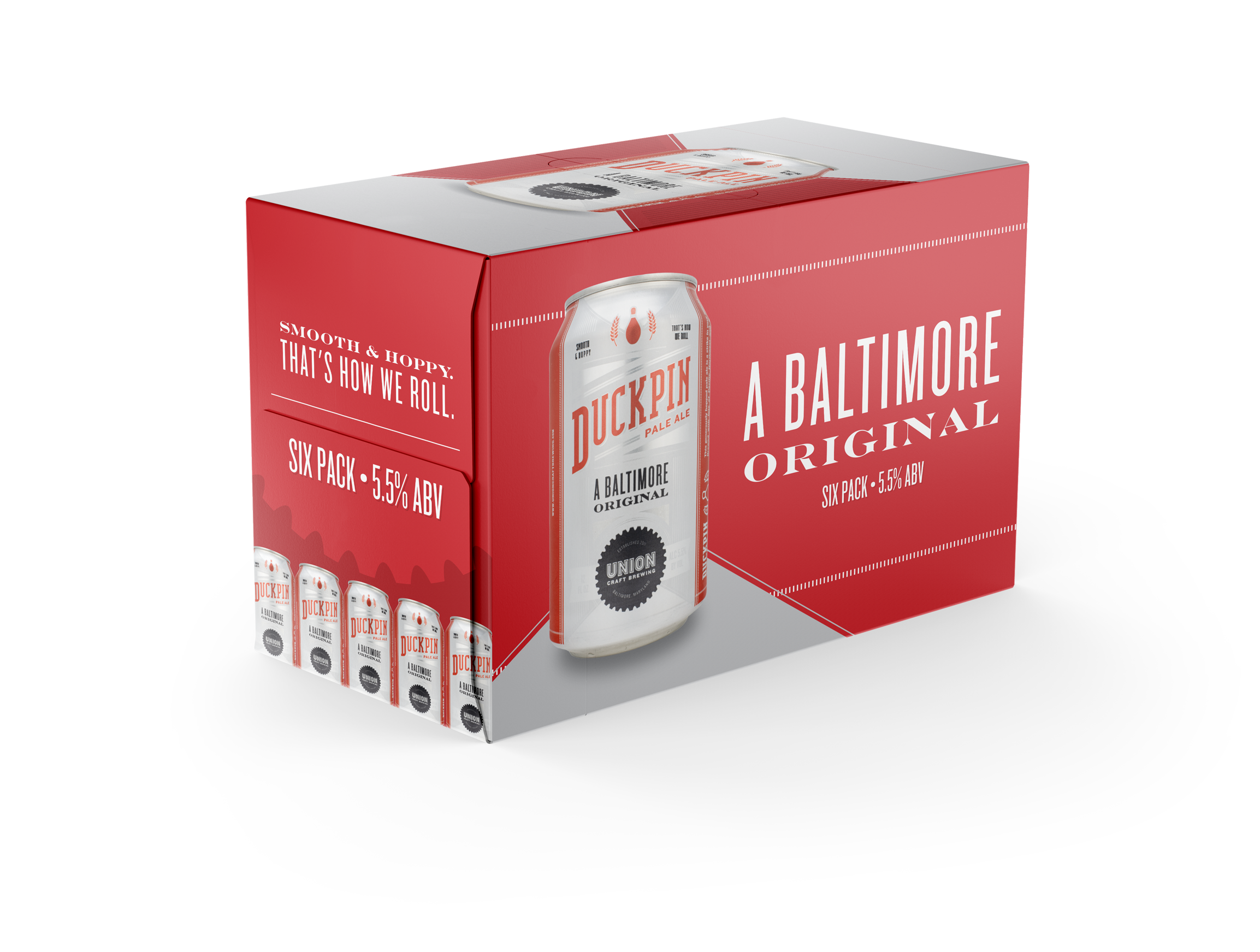
Union wanted to draw inspiration from the nostalgic theme of duckpin bowling (it’s a Baltimore thing, look it up) for their flagship brew, aptly named “Duckpin”.The Solution:
By utilizing elements reminiscent of a bowling lane for framing, such as the distinctive markings and patterns, we were able to infuse a sense of authenticity and uniqueness into the design. This design template proved to be highly successful and seamlessly translated to their other core beers, each of which boasts its own iconic flair and carefully curated color palette. The result is a collection of beers that not only pay homage to the sport of duckpin bowling but also stand out individually with their own distinct visual identities.
Over the span of the original design of the core beer cans, Union sold approximately 3.5 million cans.

-
The Challenge:
Our task was to develop a brand identity for Union's research and development division, known as "Rough Draughts," that would not only be easily identifiable as part of Union but also have its own distinct presence.The Solution:
After extensive brainstorming, research, sketching, and refining, we arrived at a simple yet effective solution for the Rough Draughts logo. Given the widespread recognition of the gear icon associated with Union, we decided to leverage that element to create a sub-brand specifically for the experimental brews in testing. The inclusion of "R/D" in the logo serves a dual purpose, representing both "Rough Draughts" and "Research & Development."The limited series cans have always been an exciting venture for us, as they provide an opportunity for unrestricted creativity and pure expression of each unique beer. During this process, we give prominence to patterns, typography, and custom illustrations, allowing them to truly shine and contribute to the overall visual appeal of the cans.

-
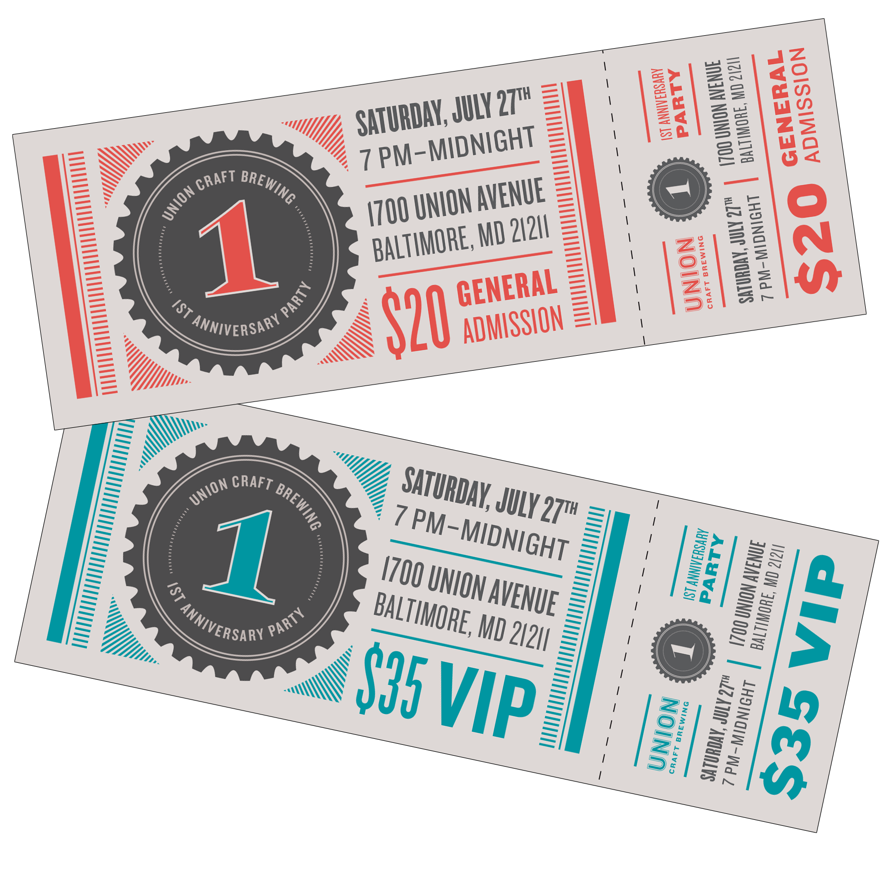
As a central hub in the community, Union is constantly buzzing with activity and hosting a wide range of events. This vibrant atmosphere creates a constant demand for merchandise and promotions that capture the essence of Union and their events. We view each opportunity as a chance to craft something fresh and distinctive, aligned with the spirit of the occasion.


